Collapsible “hamburger” menus are used in web design to hide navigation buttons or filters except when expanded so these elements don’t take up too much space and end up creating a cramped layout. This is especially helpful for mobile layouts where space is at a premium.
The ability to add a Show/Hide Button for Layout Containers was added in Tableau v2019.2 and only works with floating containers. It is often recommended for mobile UX to place the navigation bar along the bottom of the screen, but the floating-only limitation makes this impractical in Tableau unless designing for one specific mobile device or for a view that doesn’t need to scroll.
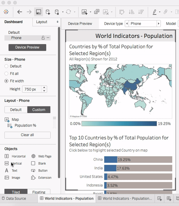
The following example walks through adding this button to the mobile layout of a dashboard that references the Tableau sample data source World Indicators.hyper.
1. Add a floating layout container
2. Add your filters or navigation buttons to the layout container (this example uses filters)
3. Click the dropdown carrot for the layout container and select “Add Show/Hide Button” from the menu. You also have the option in this menu to “Rename the Dashboard Item” (Layout Container) as something descriptive.
4. Alt+click on the “X” icon that appears to collapse and then expands the contents of the layout container. Once the dashboard is published users will only need to click, not Alt+click, to use the button.
5. Format the Show/Hide Button and the layout container with the filters or navigation buttons to fit your dashboard design.